ArcGIS QuickCapture @Esri
Capture any field data with the touch of a button
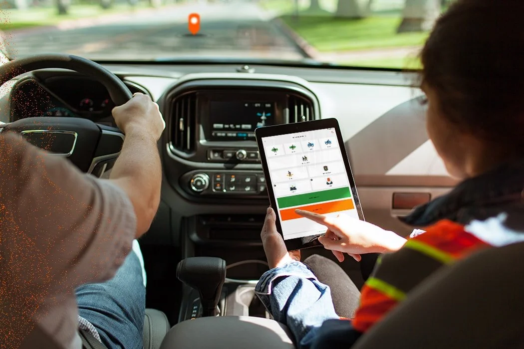
QuickCapture is the fastest way to collect field observations. With this simple app, field workers can quickly record field data from a moving vehicle while they scout locations, conduct aerial surveys, or assess damage. Send data back to the office for analysis in real time and eliminate time spent manually processing handwritten notes.
It has been used to fight fires in Portugal, support search and rescue in Florida, help control access to beaches in Spain during Covid pandemic…
Timeline
Dec, 2018 - Dec, 2019
My role
I was the sole product designer on QuickCapture project.
I worked with 1 product manager, 5 engineers, 1 marketing analyst and 1 part-time graphic designer.
Links
Mobile app: Google Play, App Store
To comply with my non-disclosure agreement, I have omitted and obfuscated confidential information in this case study. All information in this case study is my own and does not necessarily reflect the views of Esri.
The opportunity
Why traditional data capture workflow doesn't alway work
The key to field data capture is to capture information about objects along with their location. It is the foundation of any mapping and location analysis.
Currently, almost all of the field data capture apps use “form-centered” workflow. While it is great for professional field workers to capture detailed information, it doesn’t always work.
Traditional form-centered data capture workflow
It’s not intuitive for non-professionals to use maps and layers
Traditional form-centered data capture often requires knowledge about maps and map layers. It poses a high learning curve for non-professional field data collectors.
It’s too time-consuming to fill in forms when the time is urgent
Many job require field workers to capture data in a moving vehicle, sometime even in helicopter. The field worker needs to record information fast and move on quickly. Typing in forms is too time-consuming.
The idea💡
Button centered workflow
The idea is to create one button for each data type. As soon as user taps the button, the pre-defined data along with location information will be captured.
This workflow is great for capturing simple field observations rapidly. And there is almost no learning curve for users from any background.
While the idea is simple and straightforward, to make one app fits all types of field work scenarios and data types is the real challenge.
Our plan is:
To create a mobile app for field workers to capture data
To create a web app for GIS professionals to configure and distribute data capture projects
The research
Only being quick is not enough
In order to understand how users will use this workflow in real world, I interviewed a bunch of target users from different industries. These are the key insights defined the launch version of the QuickCapture.
Accuracy is important too
Do not distract me
Need to work offline
Minimal learning curve
Communicating user research is as important as conducting them
I created a user story mapping for the team to see the border user contexts and focus on the essence of the experience.
I also created 3 proto personas based on the interviews. With this, whenever we make decisions, we would mentally go back to the cabin of a helicopter, a rusty maintenance car without air condition in Panama or a quad in the middle of an agricultural field.
QuickCapture mobile
Building the buttons
Just enough elements
Simplicity is the key to fast recognition. After rounds of testing, I identified 3 visual elements of the button for field works to get enough information to do their job: Label, Image (optional) and Take photo indicator (optional).
Ensure color contrast
Most field work are done under direct sun light, I use black or white font colors based on background color to ensure visibility.
Larger touch target
The minimal tap target is 72*72px, to make buttons more visible and easy to tap in a fast-paced environment.
Keep things clear among distractions and task-switching
Unlike office settings, field works can be busy and full of distraction. Field workers can’t always delicate 100% of their attention to the screen. They need to find things quickly and be confident that every action they took is correct.
I use progressive disclosure in every feature design to reduce cognitive load as much as possible.
Over-designing for anxiety
Whenever user captured a piece of data or took any critical actions like updating locations, deleting data, etc, the confirmation is communicated though toast message, voice message and vibration.
Keep users informed
Accuracy is key for this job. I added a mini status bar at the bottom to keep users informed about the current GPS accuracy. When the GPS accuracy is too low, the buttons are all disabled to prevent user from capturing inaccurate data.
This GPS status bar also eliminates the need of displaying a map, which keeps capture screen simple and is more intuitive to understand.
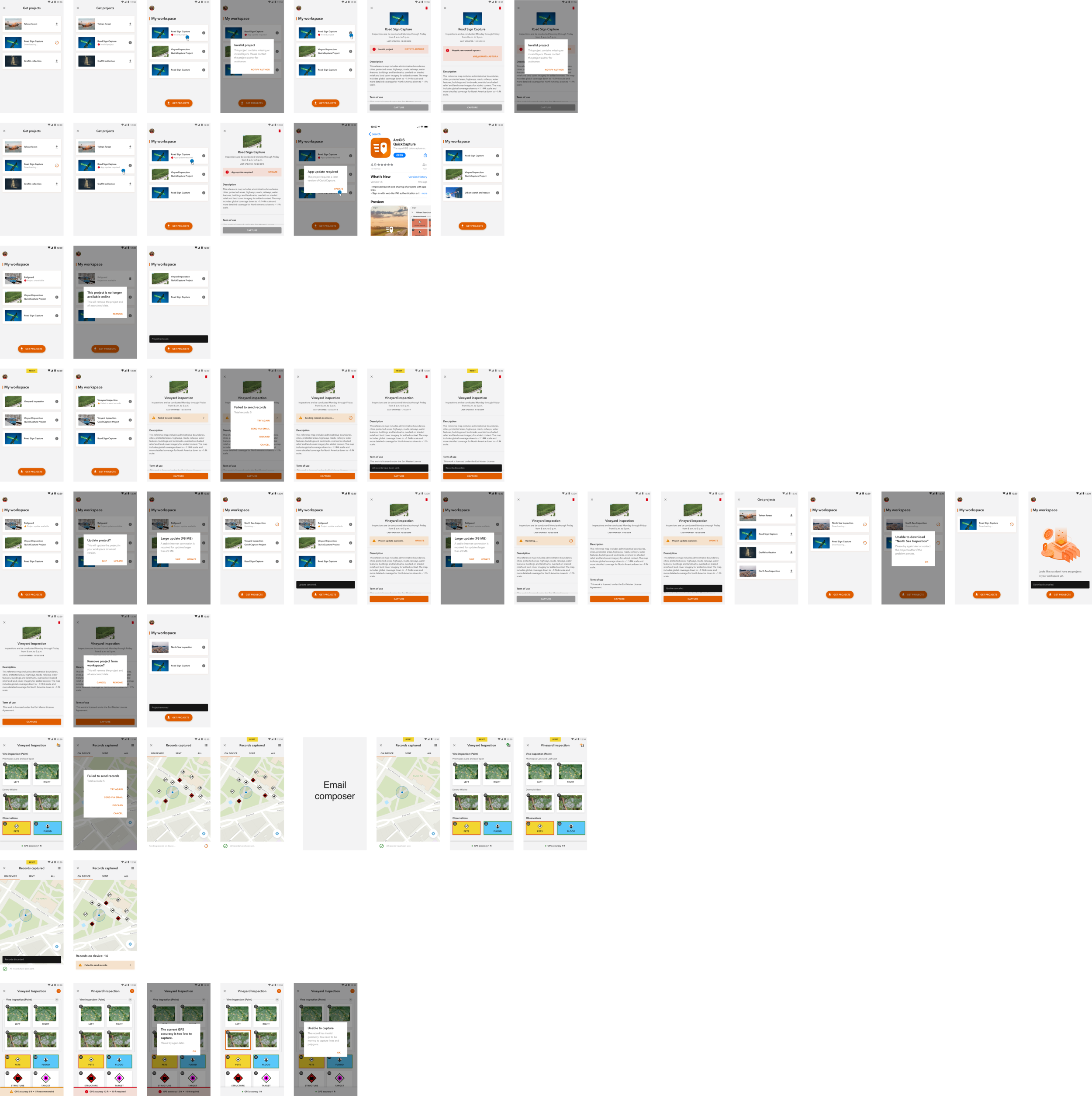
Error handling workflows
We’ve got your back
Though we tried to optimize the app to prevent error from happening, it is hard to prevent them all.
I was able to work with dev team to identify all the possible error states, and crafted the workflows to help users get back on track.
Help users navigate by providing clear UX copies
Providing intuitive and helpful UX copies is just as important as creating the interfaces. And it is especially true for the field workers. Unlike people in office, they don’t have time to think on the vague copies and they often work in offline environments so it is impossible to look anything up.
I created communication guidelines for QuickCapture, in which I defined the tone, grammar, vocabularies Do and don’ts on writing messages. This enables us to create efficient and consistent UX copies. It also reduces ambiguity after translations.
Most team members are not familiar with UX writing back then, so I also held a workshop to help the team create better copies.
QuickCapture Communication guideline
Slides from my UX writing workshop
Provide both light and dark theme
Field works can happen in daylight or at night. I designed both light theme and dark theme to match user’s environment. This will also help reduce eye strain.
QuickCapture web app
A tool for GIS professionals to create data capture projects and assign to field workers
Let GIS professionals to do what they are good at and leave the rest to us
Design is not the strong suit of most GIS professionals. Therefore, we made the button appearance configuration easy for them. I curated limited set of options for them to choose from. All of the options are tested to be accessible and nice-looking.
Label
Image
5 button sizes
3 shape options
Background color: preset color palette provided
Color code data type for quicker scan
One button can potentially linked to many type of variables. I identified the 4 key data type to help GIS professionals to quickly scan and proof read.
Static text
Device variable
Project user input
Notes
Provide templates for inspiration
We also designed several project templates based on the most common use cases.
See all templates in Gallery
The testings
Test my assumptions every step of the way
I worked closely with PM to test each design iterations with customers at early stage. Watching users using the app in real world scenario and having conversations with them was a very effective way to identify usability issues and sparkle ideas.
With the first few rounds of usability testing on beta version, we were able to identify and solve all critical usability issues before QuickCapture official release.
The impact
By the end of 2020, QuickCapture has been adopted by over 6,000 organizations across the world. The average daily active users are over 60,000.
It has been used to fight fires in Portugal, support search and rescue in Florida, help control access to beaches in Spain during Covid pandemic…
“QuickCapture was a perfect solution for us. It is affordable, easy to use, and I think I can have anybody with minimal training doing quality work on it. “
“The contractors have embraced QuickCapture because there’s no learning curve with it.”
“Our users are impressed. Now we can deliver data collection solutions quickly because it is so intuitive.”
“We built a photo inspection proof of concept project in under an hour and it worked so well now we have 16 inspectors using the app. Be warned: Taking full advantage of the app requires good knowledge of ArcOnline. But the app is a game changer for field crews: it can’t get simpler for them”


